I feel that this map has a lot of information on it. It seems to be a bit messy, clarity could be better. The color scheme could also use a bit of work, I feel that the blue marking Obama and Clinton are too close to the same shade along with the water for Lake Michigan. I feel that this map is legible, I can read all labels. I think that the districts are divided in a way that is easy to see and the map reader is able to ident 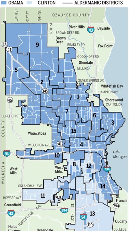
0 Comments
I like this map because the clarity is good. The color scheme could use some work, I see that the Antarctic plate and surrounding land is the same color as the Nazca plate and surrounding land. The labels are easy to read. I like how the outlines of all of continents are there as a reference point, it helps the map reader identify where they are. This map is interesting because it shows how all the plac 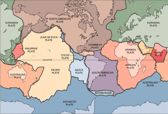
I like this map a lot. The visual hierarchy shows that the red points are important and that the white dots are less important. The USGS did a good job of making the state names legible and the borders are easy to see. I also enjoy the fact that I can see the seal level elevation and where the water level drops off. 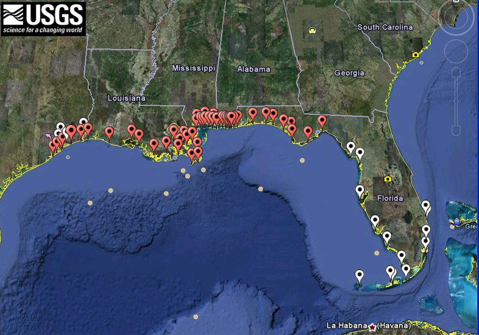 This map has a good color scheme. The clarity is good, I can read all labels. I do feel though that with the darker colors the county border tends to disappear a little. I think that is a little confusing. I like that the cartographer chose to do a color scheme to represent the data instead of putting the raw numbers on the map, the colors are much easier to read. 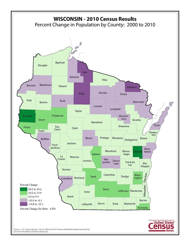
This map was hard to read at first glance because I feel that the legend is upside down. It should be the smallest percentage on top to the largest percentage on the bottom. I also feel that the numbers get lost since this is a grayscale map, the color scheme could have been modified to help the map reader. 
With this map, I wanted to look at the population of females in the United States. I have noticed that a lot of college campuses have become female dominate, and I wanted to know if this trend was going to continue. To me this map proves that this trend will continue and it will be larger in California, and the east coast. I like the color scheme I chose because the color of the circle really pops against the white background. 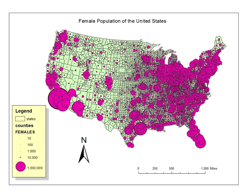 This map was the first map I did in ARC GIS. I like arc gis better because this program did all of the coloring and making of the legend for you. Although I am very thankful that I was able to learn how to do all of that in Adobe Illustrator, I am happy that there is an easier way to do it. With this map I wanted to know where the baby boomers are living in the United States. I am interested in the baby boomers because they are a big part of American society. I do know that in my history career I want to do something 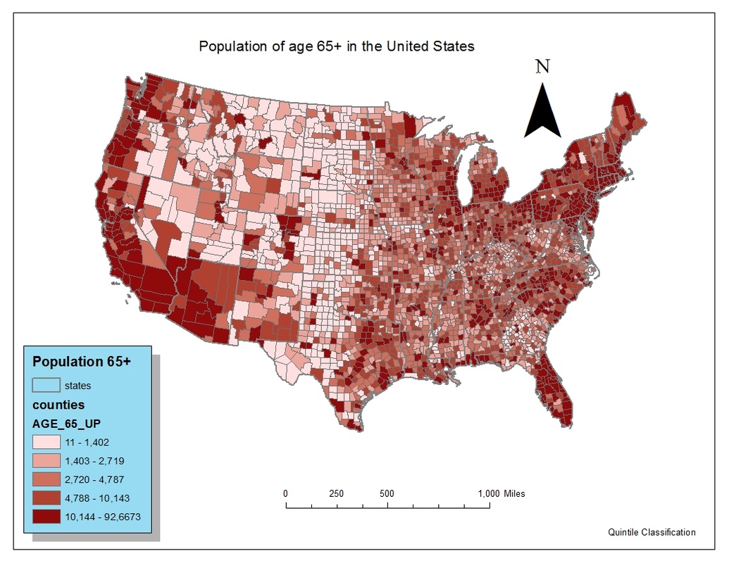
As I was doing my OWI map I realized I wanted to know if there was a correlation between divorce rates by county in WI and the OWI arrests. I found that there was some correlation between the arrests and divorces. I feel that this map does a lot of things neatly all at once. For one, it shows two different sets of data on one map. and it also is easy to read and see patterns. I really liked doing this map because I feel that I can use this technique in my future work. I think that relating two different sets of data on one map and seeing a pattern will be helpful to me as I go into my history career. 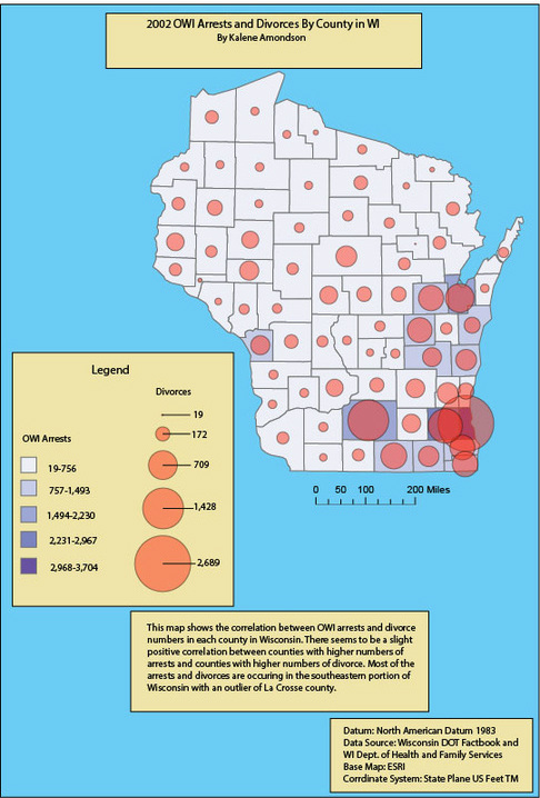 In this map, I was able to choose what I wanted to map. I chose to map data from the Wisconsin DOT fact book. I wanted to know which county in Wisconsin had the highest OWI arrests. This map has good visual hierarchy. I put the circles as a red because I feel that they are one of the most important things on this map. The way the data is showed on this map is interesting to me because before this class I would have never thought of making a map like this to show which county had the highest arrest rate. I would have done a bar graph. This is much more eye appealing. 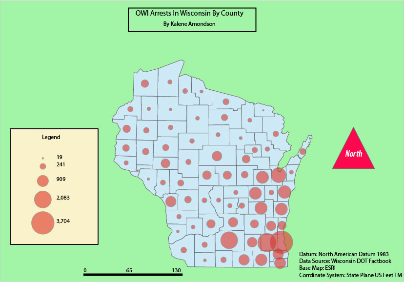 In this map I had to classify two sets of data, absolute numbers and percentages. We were given two methods to classify these data sets, the quintile method and the equal interval method. I feel that the quintile classification is much more interesting to read and look at. It shows more color and more variation. But I also like the equal interval method because it gives you the opportunity to see patterns that may not appear in a spreadsheet. 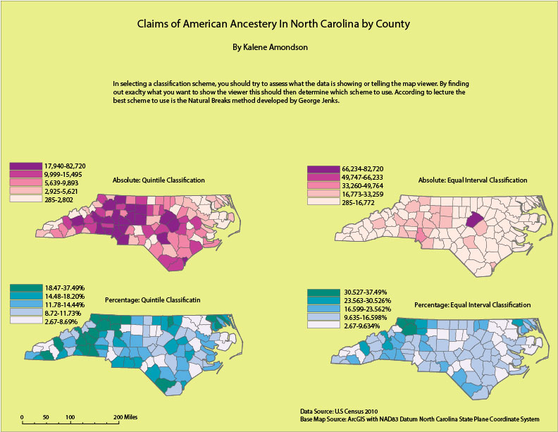 | Kalene Amondson
|
|
|
 RSS Feed