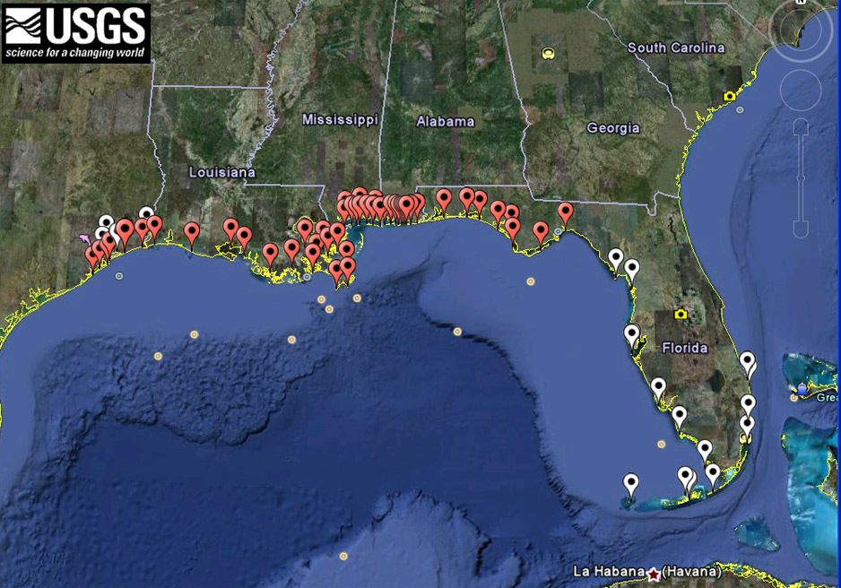
I like this map a lot. The visual hierarchy shows that the red points are important and that the white dots are less important. The USGS did a good job of making the state names legible and the borders are easy to see. I also enjoy the fact that I can see the seal level elevation and where the water level drops off.
 RSS Feed