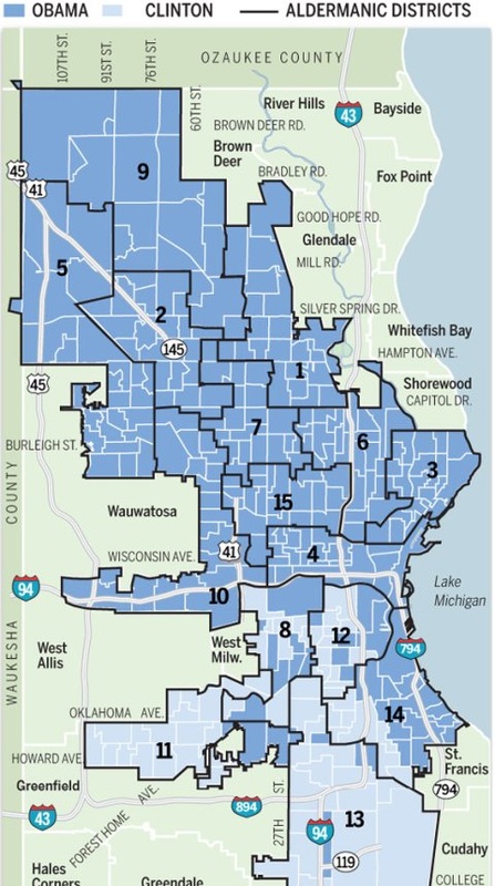
I feel that this map has a lot of information on it. It seems to be a bit messy, clarity could be better. The color scheme could also use a bit of work, I feel that the blue marking Obama and Clinton are too close to the same shade along with the water for Lake Michigan. I feel that this map is legible, I can read all labels. I think that the districts are divided in a way that is easy to see and the map reader is able to ident
 RSS Feed