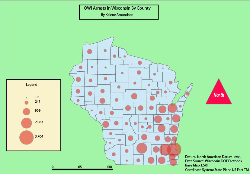
In this map, I was able to choose what I wanted to map. I chose to map data from the Wisconsin DOT fact book. I wanted to know which county in Wisconsin had the highest OWI arrests. This map has good visual hierarchy. I put the circles as a red because I feel that they are one of the most important things on this map. The way the data is showed on this map is interesting to me because before this class I would have never thought of making a map like this to show which county had the highest arrest rate. I would have done a bar graph. This is much more eye appealing.
 RSS Feed