This map was a map of what I knew as my neighborhood as a child. I know that this map was not put together nicely. The visual hierarchy is non-existent, clarity is an issue because you can barely read the name in the river. I feel that this map was the most difficult because I was unsure of how much to label and what to label. Looking back I feel I should have put more labels, had more colors, and made the street labels separate from river labels. 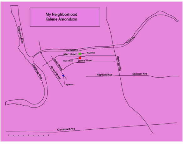
0 Comments
With this map, I wanted to see my shopping habits within the last 6 months. I enjoyed going outside and collecting the data myself it was a great experience. I also liked that the GPS tracker I was given to use. It was very user friendly, and the points uploaded well to a computer. With this information, I can now tell that I tend to shop in cluster depending on where I am in the city. I work right off of the interstate so most of my shopping is done by my work at the mall. I like the fact that I was able to use my own data and develop a pattern out of it. 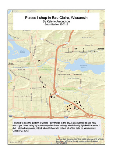 For this map we had to look at 10 different projections of South America. I learned that in map making how you project an area can change how it looks and how much the land is distorted. By using 10 projections I really got to see just how much one projection can change a whole landscape. I found this project very helpful because I can use this in my future work as a historian looking at different places and seeing if the way it was talked about in the past changed how it is viewed in the present. 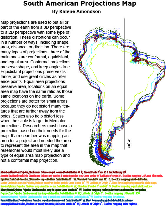 This is the first map I created in my class, we had to label all countries and waterways in Africa. This map was a great way to learn how to make a map not only legible but also have clarity and be able to read all labels. I used a qualitative color scheme because we could not have the same color countr 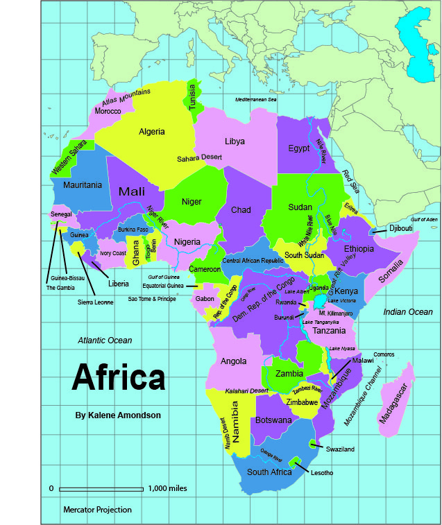
| Kalene Amondson
|
|
|
 RSS Feed