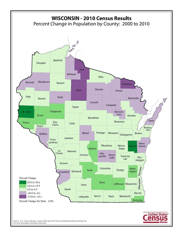
This map has a good color scheme. The clarity is good, I can read all labels. I do feel though that with the darker colors the county border tends to disappear a little. I think that is a little confusing. I like that the cartographer chose to do a color scheme to represent the data instead of putting the raw numbers on the map, the colors are much easier to read.
 RSS Feed