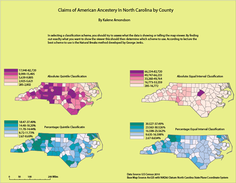
In this map I had to classify two sets of data, absolute numbers and percentages. We were given two methods to classify these data sets, the quintile method and the equal interval method. I feel that the quintile classification is much more interesting to read and look at. It shows more color and more variation. But I also like the equal interval method because it gives you the opportunity to see patterns that may not appear in a spreadsheet.
 RSS Feed