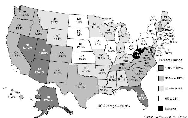
This map was hard to read at first glance because I feel that the legend is upside down. It should be the smallest percentage on top to the largest percentage on the bottom. I also feel that the numbers get lost since this is a grayscale map, the color scheme could have been modified to help the map reader.

 RSS Feed